Pages

Thursday, May 28, 2015

Group B- WWC, Copa America

As the clock continues to kick to kickoff, with only nine days to kickoff of the Women's World Cup in Canada and fourteen days to the Copa America in Chile, the rundown of the uniforms for the teams in both of these tournaments continues, today with Group B of both tournaments.


At the top of Group B on the women's side sits Germany, the number 1 team in the world and one of the favorites to win this World Cup, along with France, the USA, and defending champions Japan. The Germans, two-time champions, wear a traditional primary kit, all-white with red and black accents, in the style the men's team won the World Cup in last year; their secondary kit, however, is much different from the one worn by the men: solid red with only black accents. No white appears on the secondary adidas jersey.

Côte d'Ivoire, or Ivory Coast in English, are the lowest-ranked team to have qualified for Canada 2015, at 67th in the world. The Ivorians are another one of the teams to have not changed their kits for this season, sticking with the all-orange from Puma for the primary kit and monochrome green for the secondary. Although the kits pictured were worn by the men's team, the only difference for the women is the cut of the jersey itself. One thing to take note of is that there is still a possibility of a third kit being introduced by Ivory Coast, likely in white, to allow for a "light" colored option.

Although the biggest controversy leading up to the World Cup came over some matches being played on turf, in Europe some heads were turned towards the Norway national team, who currently sit 11th in the world. When the first kits for the country from Nike were seen on pitch for the first time, the women's team didn't have the female-cut kits, instead wearing "gender-neutral" jerseys. After some uproar, Nike said that they would provide new kits, but not before the world cup. Therefore, by default, the Norweigans will be the worst-dressed team at this tournament BY FAR. Ouch.

The final team in Group B on the women's side is Thailand, who will be making their World Cup debut this spring and summer. The women, who currently sit 29th in the world, will be sporting new jerseys from Grand Sport, a Thai manufacturer, in primary red and secondary blue options. As with Ivory Coast, there is the possibility of FIFA forcing Thailand to introduce a third kit, most likely in white, to provide a "light" option.


The best team in Group B of the 2015 Copa America is easily Argentina, the 14-time continental champions. Los Albicelestes, who finished runners-up at the last World Cup and currently sit 2nd in the world, are the favorites to take the title this year in Chile. adidas has done another stellar job with the Argentina uniforms, going classic blue-and-white stripes on the primary kit and a full-navy blue look for the secondary kit.

Yet another team in the Puma skintight uniforms, Uruguay help contribute to making Group B the "Group of Death" at this Copa America. The defending champions, currently 8th in the world, had a disappointing showing at the World Cup, but look to bounce back this year. Obviously, karma does not play a major role at Uruguay, as La Celeste will be wearing the same kits for the second year running, sky blue on the primary and all-white for the secondary kit.

On the bottom half of Group B, the future does not look bright in this tournament for either of the bottom two teams. Paraguay sit 81st in the world, next-to-last in CONMEBOL. Although their tournament hopes might not be sharp, their adidas kits are: Paraguay will wear red and white stripes on the primary kit and go with a solid grey secondary kit that includes sublimated light grey hoops down the front.

The final team in Group B is the second of two CONCACAF teams, Jamaica. The Reggae Boyz changed kit manufacturers from 2014 to 2015, going now with Romai Sportswear, a UAE-based manufacturer. The kits were revealed earlier in the year to very little fanfare, showing that the 74th-ranked Jamaicans will be wearing two non-white kits this year, green as the primary and yellow as the secondary kit.

With the Women's World Cup starting in just nine days, it becomes crunc time to finish uniform rundowns. Group C in both tournaments might be up tomorrow, Saturday at the latest. Yes, this will be the quickest I have posted two posts yet, but get used to it. Three major international tournamens this summer requires it.

Sunday, May 24, 2015

Group A- WWC, Copa America

Although this is a bit late, the rundown of the uniforms for both the FIFA Women's World Cup and the Copa America are here, starting in Group A for both competitions. Firstly, the uniforms of the teams in Group A of the 2015 FIFA Women's World Cup:

The top team in Group A is the host, Canada. The Canadien women, currently ranked 8th in the world, are making just their fifth appearance at a world cup, this time not having to qualify by virtue of being the host nation. Canada unveiled new primary and secondary kits for 2015, although they don't stray much from previous Canada kits. The primary red kit and secondary white kit both do not stray much from previous jerseys, although the sublimation applied to the white jersey by Umbro is certainly unique in the footballing world.

The second-best team in Group A is the 12th ranked Leeuwinnen, or Lionesses, of the Netherlands, who have qualified for their first ever world cup. The Holland women are sticking with the same primary kit they wore in qualifying for the World Cup, the all-orange ensemble, but have changed their secondary kit to a white jersey that virtually mirrors the primary. This white kit from Nike replaces the blue design worn by the team in qualifying for the World Cup.

The final two teams in Group A are currently ranked 16th and 17th in the world, China PR and New Zealand, respectively. China PR, or the Forceful Roses as they are known in their home country, are in their first year as a Nike team after more than 30 years with adidas. For their first year with a new supplier, China PR will be wearing two heavily templated designs, all red for the primary kit and an all-white secondary. Both jerseys are based off of generic Nike templates, unlike last year's adidas design, which featured a custom-designed look featuring dragon scales on the front of the kit.

The Football Ferns of New Zealand are appearing in their fourth World Cup, but enter as the underdogs of Group A. This position as underdog is reinforced in that New Zealand has never won a World Cup match in nine tries and has only scored five goals in their WWC history. The Football Ferns will be wearing the plainest kits of the group, all white for their primary kit and all black for the secondary from Nike.


Kicking off the 44th Copa America will be the hosts, Chile, who hold the title of being the best team in Group A at 16th in the world. Although things could change between now and the first match for Chile, it appears that they will be wearing the same kits worn at the FIFA World Cup in 2014, the skintight red primaries and white secondary kits from Puma.

One of two guest teams to the tournament, along with Jamaica, Mexico are one of the favorites to advance out of group play, although their adidas jerseys do them no favors. For the first time in national team history, Mexico, who enter 22nd in the world, are not wearing a green kit. To add to the misery, there is no real green on either the primary black or secondary white kits, instead featuring a neon shade of green that might best be described as lime green, not the national color.

Topping the list of "major teams with tiny uniform suppliers" is Ecuador, who sits 34th in the world, but still gets jerseys from Marathon, a company based in Ecuador. The national team kits haven't changed much in the last 15 years, with the same basic design sticking around on the primary yellow and secondary blue jerseys. Just like Chile, it appears that Ecuador will be sticking with the uniforms they wore at last summer's World Cup through 2015 as well.

The final team in Group A of this Copa America is currently the worst team in CONMEBOL, Bolivia, who currently sit 92nd in the world. The Bolivian team made a major jump before this tournament, which many in the country see as a starting point towards international viability, and Bolivia reinforced that idea by getting new uniforms for the first time in three years They join Ecuador as the only two national teams sponsored by Marathon, but will stick with the basic primary green and secondary white jerseys.


Now that school is winding down, the soccer season jumps into full swing, so I should be coming out with more posts on a regular basis, most likely once or twice a week, covering the uniforms of all of the teams in the Women's World Cup, Copa America, and the Gold Cup. If my next post isn't up tomorrow, it will be by next Sunday. Hopefully.

Saturday, May 16, 2015

NEW POST SCHEDULE

It seems that college baseball and softball just don't have the coverage of other sports such as basketball, so I will be abandoning the idea of making the next set of posts on them. Instead, with the large amount of international soccer being played this summer (FIFA Women's World Cup, Copa America, Gold Cup), I will instead be turning my attention to the national teams playing in these tournaments. The WWC will be starting on June 6, so I will try to cover the uniforms being worn by the 24 teams in the tournament in the days before it starts, going group by group. I will be doing the same for both the CONMEBOL Copa America and its 12 teams, and the CONCACAF Gold Cup and the 12 teams participating there. Hopefully, I should have up the uniform rundown for Group A of the Women's World Cup done by Friday at the latest, and the other five groups done by the June 6 kickoff date. Hopefully.

Monday, April 27, 2015

Post Schedule

As the college basketball season ends, it makes no sense to continue to do college basketball uniforms, especially as new jerseys are unveiled and the placing of logos changes during the offseason. Until next January, most likely, I will be shifting gears to another sport. Right now, I am leaning towards covering the same subject, the placing of conference logos on uniforms, with college baseball, possibly softball as well. Now that the school year winds to a close, I hope to be able to make these posts start coming out weekly, barring only a few exceptions. Hopefully, my first post of baseball/softball will be coming this Saturday or Sunday, May the 1st or 2nd. Thanks to everyone that still follows this blog, even through interruptions, and I hope to have the next full post up Sunday night at the latest.

Monday, March 30, 2015

#3 in a series: AAC logo usage

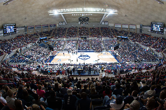
Well, I completely forgot about doing this post for about three weeks, what with finals at school and the start of a new soccer season, then another week for spring break, but now that spring break is over I finally found time to finish up the post on the American Athletic Conference, home of the defending men's and women's national basketball champions, Connecticut. In the AAC, there is a large divide in groupings of the 10 teams. 8 teams are aligned with Nike, but only 2 with Under Armor and 1 with adidas. The conference patch placement is also very uniform, with all schools using the conference's primary logo; 7 schools place it on the front right side of the jerseys, 3 put it on the left side. The school-by-school breakdown is as follows:

SMU Mustangs

The top team in the AAC is the SMU Mustangs, led by Larry Brown, the oldest coach in the conference. The best way to describe SMU's Nike uniforms would be paint-by-numbers: the only change from jersey-to-jersey is changing the placing of colors. SMU is also the only team in the conference to change the color of the conference logo from jersey to jersey: it is in red on the white jerseyswhite on the red jerseys, and red on the blue jerseys. On all three, the logo is on the right side of the jersey.

Tulsa Golden Hurricane

Tulsa holds the dubious record as being the only team in the American with more than three uniforms: Nike provides the Golden Hurricane with four. On all of them, the conference patch is located on the right side of the jerseys, on the white, gold, blue, and black jerseys. The only picture I could find of the Tulsa blue jerseys came from this article, which gives a more in-depth look at the jerseys.

Temple Owls

The Owls of Temple are just one of two teams in the AAC supplied by Under Armor, and just one of three with only two uniform combinations. The most interesting part about Temple's uniforms is that they wear cream, not straight white, at home. On both the home cream and road maroon jerseys, the conference logo is on the player's left collarbone.

Cincinnati Bearcats

The only team in the AAC to be supplied by adidas, the Cincinnati Bearcats are therefore the only team that recieved a special set of postseason uniforms, which to me seem incredibly pointless. On all Cincinnati uniforms, the American logo is placed on the front right side of the uniforms: home whitesroad blacks, and the pointless (and sleeved!) postseason uniforms.

Gampel Pavilion-UConn
Connecticut Huskies
XL Center-UConn
The defending national champion UConn Huskies are the only team in the AAC to play multiple home games at two different arenas. They also join the trend of GFGS uniforms, adding a grey alternate to their normal home and road jerseys. UConn placed the conference patch on the left side of all three uniforms, white, grey, and blue.


Memphis Tigers

Sadly, Memphis has joined the growing legion of teams to add a GFGS uniform, which drops down an otherwise solid uniform set. The Tigers, just like UConn and East Carolina, are one of just three teams in the American to put the mandatory conference logo on the left side of the jerseys, doing so on the whiteblue, and grey uniforms (which I could not find a definitive picture of, only side shots).

Tulane Green Wave

Add the Green Wave as well to the list of teams with a GFGS uniform, which is quickly becoming more and more prevalent in sports. Tulane has a very modern set of uniforms, in contrast to its 82-year-old arena, Devlin Fieldhouse. Tulane is another of the seven AAC  teams with Nike, and join  the majority by placing the conference logo on the right front of their whitegreen, and grey jerseys.

East Carolina Pirates

Joining the ranks of Nike teams in the American, the East Carolina Pirates are one of the few teams in the NCAA to utilize purple in their color scheme. However, with the depth of ideas that could be put forward by the pirates, their uniforms fail to appease the imagination. The placement of the conference patch, as well, is confusing. On the whiteyellow, and purple jerseys, the conference patch is always on the left side of the jerseys. Surprisingly, with the amount of black used by the Pirates in their color scheme, it doesn't look as if they have a black jersey.

UCF Knights

Now that UCF has cut down on half of the garishness of their basketball program, removing the pinstriped uniforms (although keeping the dark grey court at CFE Arena), you can actually start to look at the Knights more as a D-1 program, and not a minor league start up. With that said, their uniforms now are quite solid (at least compared to what was worn before). The Knights put the conference logo on the right side of the jerseys for each of the three different uniforms worn: whitegold, and black.

Houston Cougars

Houston, one of seven Nike teams in the AAC, is just one of two teams in the conference with just two jerseys. On both, the conference logo is placed on the right side of the uniform, white and red.

USF Bulls

The final team in the AAC, the USF Bulls have fallen hard from three NCAA Tournament victories in 2012 to just 9-23 this season. The Bulls are one of just two teams in the conference to be supplied by Under Armor, and have some of the worst full-time jerseys in the conference. The AAC patch is applied on the right side of the jersey on all three uniforms: the home whitesroad greens, and alternate gold uniforms.

The AAC will be expanding to 11 teams in 2015-16, with the addition of Navy from the Patriot League, which will be covered later on in this series. Now that I have the time, I will try to continue working with the Atlantic 10 up next, hopefully within the next week or so.


Saturday, February 28, 2015

#2 in a series: America East logo usage

After a couple of days of throwing up prevented me from writing this post, I'm finally able to get back near a computer without being afraid of throwing up on it. Today, I'll continue the series I started with my last post and cover the use of conference logos on uniforms with the 9 teams of the America East conference. The America East is more streamlined than the Horizon League, but still not full conformed. 3 teams use no conference logo, while the remaining 6 use the primary logo of the conference. The AEC also is more convoluted in that there are four different uniform manufacturers for the nine teams: five teams with Nike, two with Under Armor, one with adidas, and one with New Balance. Without further ado, the team-by-team breakdowns:

Albany Great Danes

UAlbany, the defending America East champions, are one of five teams under the Nike brand in the conference. Now that the Great Danes have ditched their two-color spilt shorts they wore last season, most notably in the NCAA tournament, the Great Danes have a solid set of uniforms. They are one of three teams in the conference to not wear a conference logo on either uniform, white or purple.

Vermont Catamounts

Vermont is the one team in the America East to wear adidas uniforms, and the only school with four different uniforms. Although the Catamounts' uniforms look as if they haven't been updated in 10 years, they aren't horrific (except for a completely awful grey road alternate jersey). Vermont also does not use a conference logo on three of their uniforms. The whiteyellow home alternate, and road black uniforms do not have a logo anywhere on the uniforms; however, Vermont does use the conference logo on the sleeve of their grey alternate jerseys. Yes, those are sleeved, GFGS uniforms-the worst single uniform in the conference, in my opinion.

Stony Brook Seawolves

The Seawolves of Stony Brook are in the majority as one of five teams under the Nike brand in the America East, and one of six to use the America East logo on their uniforms; however, just like Vermont, the logo doesn't appear on one uniform. The logo appears on the cream home uniforms over the left collarbone, but doesn't appear on the road red set, instead being replaced by a generalized logo used by the NCAA to represent men's basketball.

UMass Lowell River Hawks
Costello Athletic Center
UMass Lowell is the newest member of Division I, having just finished up its second transitional year. The River Hawks also play in the smallest arena in the America East, which doesn't help with recruiting; however, their jerseys are some of the best in the conference. The primary conference logo appears on the back of the jerseys on both the white and blue jerseys, basically taking the place of a nameplate.
Paul E. Tsongas Center


New Hampshire Wildcats

 New Hampshire is another of the five America East teams under the Nike brand and part of the group that does use a conference logo on their jerseys. I wasn't able to find a picture of the back of this season's white home jerseys for the Wildcats (this was the best I could find), but seeing as though the conference logo does appear on the back of the blue jerseys, I would assume that it is in the same place on the white jerseys as well.

Hartford Hawks
The Hawks play in the most interesting arena in the America East, Chase Arena, which can be seen to the left; however, their jerseys aren't nearly as interesting, with the exception of the alternate black uniforms. The Hawks' plain home and road uniforms both have the conference logo on the back, but the alternate black uniforms have no conference logo whatsoever (and are barely legible, to just add to the oddness).


Binghamton Bearcats
To me, the Bearcats have the most confused uniform identity in the America East. Binghamton has three different uniforms, white, black, and grey, from Nike, two of which use the conference logo, one which doesn't. To add to the confusion, only the black jersey has the NCAA patch for men's basketball, while neither of the other two. The white jersey is devoid of a conference patch, while both the black and grey uniforms have the conference logo on the left hip of the shorts. Adding to all of this is the simple fact that the primary color of the Binghamton color scheme is green, but the Bearcats don't have a green uniform or prominently use green on two of their jerseys.

Maine Black Bears
Getting my vote for the worst AEC uniform set is the Maine Black Bears, who, despite their name, don't use black in their color identity at all, instead opting for white, light blue, and navy blue. Throw in some horrible New Balance striping patterns that change from uniform to uniform, and these Maine uniforms earn the prize of worst in the conference. Not even the conference logo placement is standard, as the logo appears on the left hip on the white jerseys but doesn't appear on the blue jerseys.

UMBC Retrievers
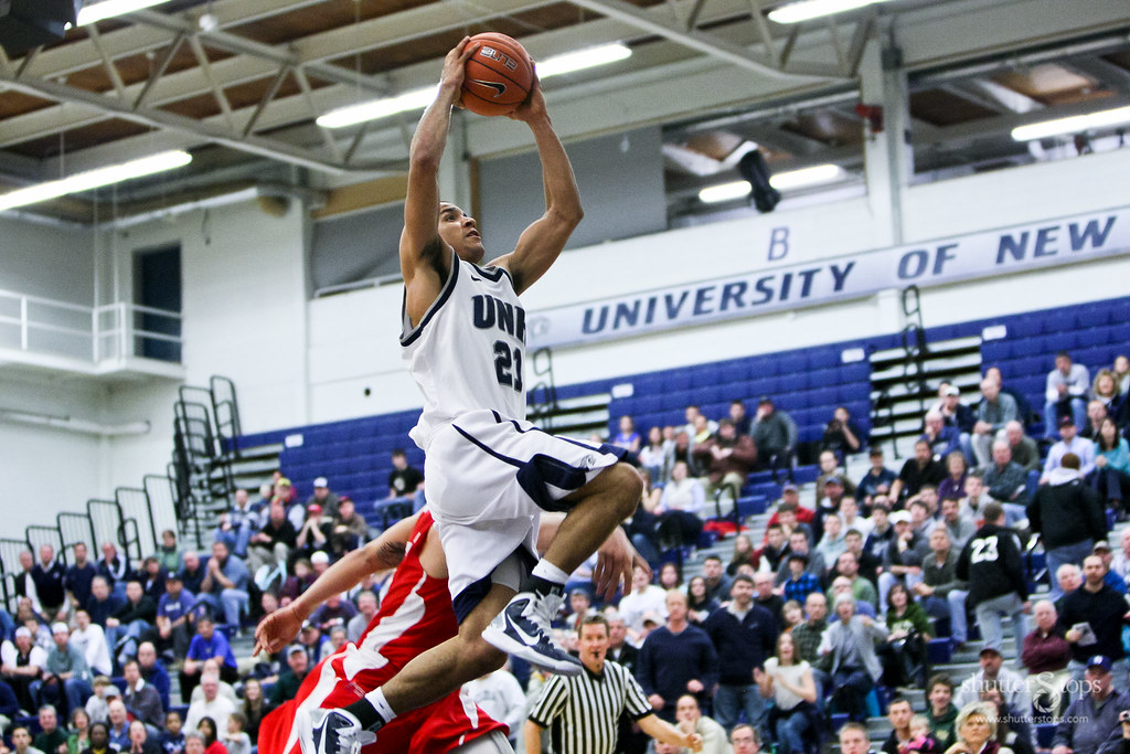
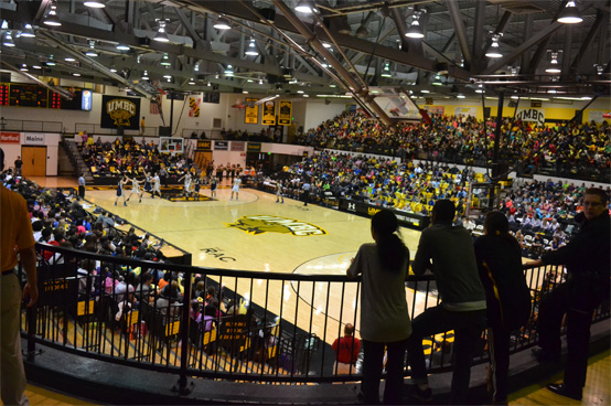
To wrap up the America East, we come to the conference doormat, the UMBC Retrievers, who do have one of the nicest arenas and uniform sets in the conference, thanks to Under Armor. The Retrievers have three uniforms, white, black, and grey (although surprisingly no yellow, considering how much of it is used in their logo). All three jerseys do not have the conference logo on them, making UMBC one of just three teams in the conference to not use logos on their jerseys.


Thanks for sticking with me over such a long layover between posts, and I'll hope to have another one up within the next few days (stomach permitting).

Sunday, February 15, 2015

Horizon League logo usage

Last night, February 13, I was at the Valparaiso vs. Green Bay basketball game. Great game, great crowd, great atmosphere. The game itself was incredible, but the uniform matchup was very nice as well. Through the duration of this game, the part of the uniforms that stood out to me was the conference logos. Most major conferences standardize use of the logo, such as the Big 10, SEC, and the Pac-12. However, the Horizon League is not a league that requires that all teams use the same logo, in the same place, on each jersey. Two different Horizon League logos are used by teams in the conference on their jerseys: the conference's main logo and the wordmark. After looking into this, the breakdown of the usage of each logo is:   - 4 teams using the primary logo
                                                                   - 4 teams using the wordmark
                                                                   - 1 team with no logo used
The team-by-team breakdown shows no real pattern in the usage of each logo. Seven of the teams in the conference are Nike: four use the wordmark, three the primary. The two adidas teams are different as well. For the breakdown of each team, in alphabetical order:

Cleveland State Vikings
Cleveland State is one of the seven teams signed with Nike; one of five under the Nike brand. The Vikings have three jerseys: white, grey, and green. On both the white and grey uniforms, the primary logo is placed above the hem of the shorts on the right leg. However, the green jersey and shorts do not have a logo on them, making Cleveland State unique in being the only team in the league to not have the league logo on one set of jerseys, but on the other sets.


Detroit Titans
Just like Cleveland State, UDM is one of the Horizon League teams under the Nike brand. Detroit has three jerseys as well: white home jerseys, red aways, and a grey alternate. The Titans use the wordmark logo on all of their uniforms, putting it on the left collarbone on all three. The quirk for Detroit is the color of the wordmark font: red on the white jersey,
black on the grey jersey, and white on the road red jerseys, making Detroit the only team in the league with three different colored fonts for the league logo.

 UWGB Phoenix
The Phoenix of Wisconsin-Green Bay also side with Nike as their jersey producer. The Phoenix, even with a color scheme of green, red, black, and white, only have two jerseys; white at home, black on the road. This season, UWGB has had at least one alternate jersey, but that will be covered in a separate post. From what I could find, it appears as if the wordmark logo only appears on the road black set, on the right hip. The white set appears to have a 3-D, raised primary logo patch where the league logo appears on the black jerseys, which would make the Phoenix the only team in the Horizon League to put a team logo on the hip of their shorts.

Milwaukee Panthers
U.S. Cellular Arena-UWM
UWM is the only team in the Horizon League to host games at two different arenas, although just one game was scheduled for the on-campus Klotsche Center for this season, with the rest set for U.S. Cellular Arena in downtown Milwaukee. The defending league tournament champions are also one of just two adidas teams in the Horizon League, along with UIC. Unlike past years, the Panthers have only two jerseys this year: white and black. Both feature the Horizon League wordmark logo on the left hip, with the font being black on the white jersey and the opposite on the black jersey.
Klotsche Center-UWM


Athletics Center O'Rena-Oakland
Oakland Golden GrizzliesThe Golden Grizzlies of Oakland, the newest member of the Horizon League, are also just one of two teams in it that are under the Jordan brand from Nike. Oakland has the most jerseys of any team in the league with 4; white, gold, black, and grey. On three of these jerseys, white, gold, and black, the Horizon League wordmark logo is placed on the top left of the jersey, around the collarbone area. On the alternate grey jerseys, the wordmark can be faintly seen in matte black, which is barely readable, just like the rest of the jerseys.


UIC Flames
UIC joins Milwaukee as one of two Horizon League teams signed with adidas, and one of four teams in the league with three distinct jerseys. The Flames wear white jerseys at home, and either red or blue on the road. UIC is included in the list of league teams that put the league patch on the shorts, opting for the primary logo on the left hip. The logo is in white on both sets of road jerseys, and in blue on the home jerseys.

Valparaiso Crusaders
Currently the first-placed team in the Horizon League, my hometown Crusaders have one of, if not the most traditional uniform sets in the league. Since scrapping the brown away and grey alternate jerseys after 2011, Valpo has had a classic feel to their uniform set. The Crusaders are counted among the ranks of Nike teams, putting them in the majority in that category in the Horizon League. Valpo uses the primary league logo on both the home white and road yellow jerseys, placing it on the right hip of the shorts. At home, the logo is printed in yellow; on the road, in white.


Wright State Raiders
Wright State is one of just two teams in the 9-team Horizon League affiliated with Nike, but having their jerseys made by Jordan. Additionally, the Raiders will be the last team in this post with three or more jerseys. On all Wright State jerseys (the white homes, green roads, and yellow alternates), the primary league logo is printed on the left hip of the shorts, in green, white, and green, respectively. An interesting note on the alternate jerseys for Wright State is that the NOB is below the player's number, not above it as is normal.


Youngstown State Penguins
The final team in the Horizon League is the outlier of these statistics: Youngstown State is the only team in the league not to wear a league logo anywhere on their jerseys. Both the white home jerseys and red road jerseys do not contain the league logo; not on either hip, not on the collarbone, nowhere. Youngstown State is also the only team in the league to not have a wordmark on the front of their jerseys, instead opting for a large letter "Y".

That'll be all for today, and I'll try to have another conference done on the same topic sometime in the next week or so.